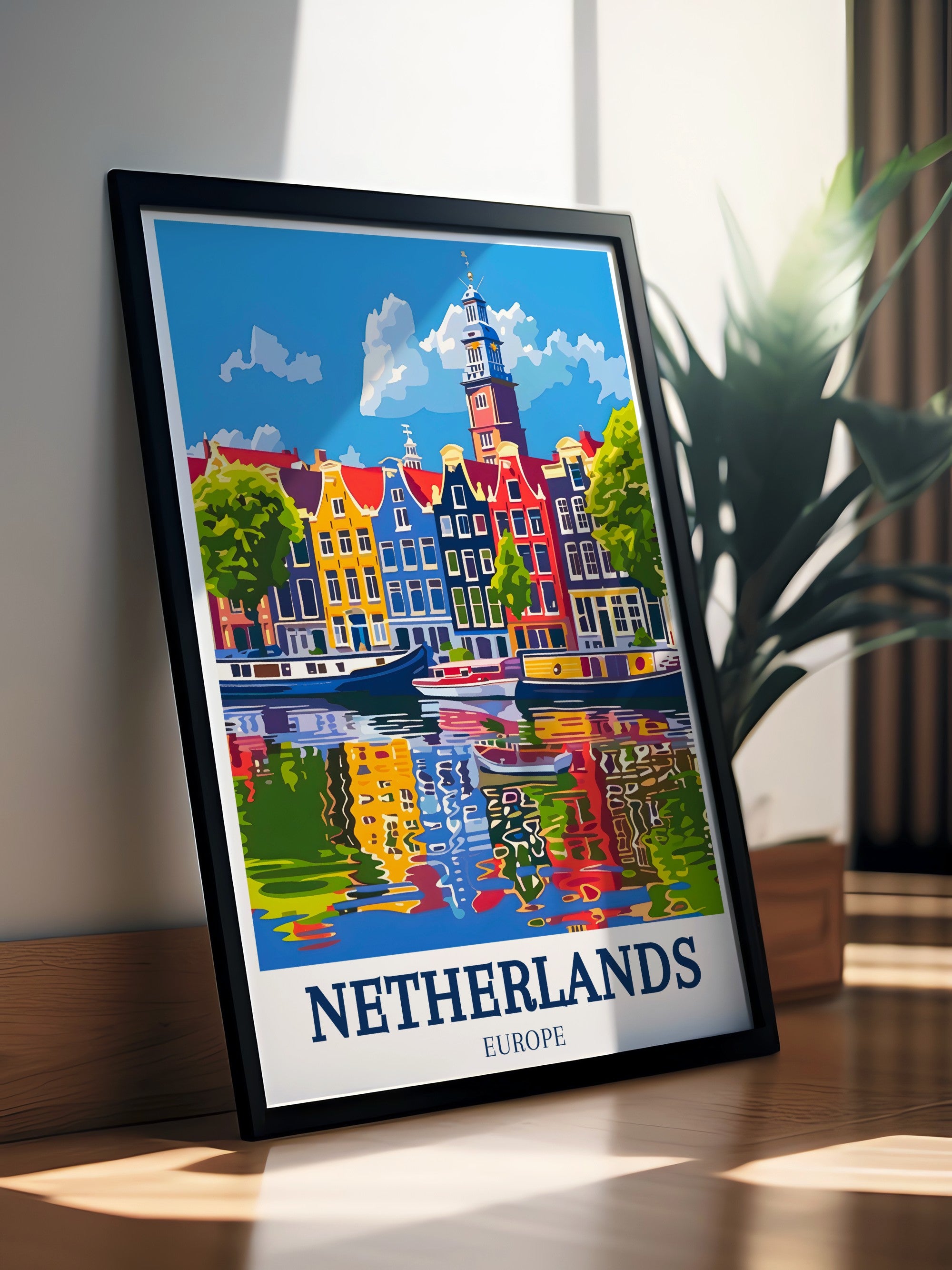
Best Wall Art for Living Room Decor in Netherlands: Expert Selection & Styling
Best Wall Art for Living Room Decor in Netherlands: Expert Selection & Styling
🇳🇱 Discover Dutch Masterpieces That Transform Your Space
📑 Quick Navigation
- Why Netherlands Wall Art Matters for Living Rooms
- Design Principles for Perfect Selection
- Iconic Dutch Landmarks & Their Living Room Impact
- Wall Art Styles & Interior Compatibility
- Color Psychology & Mood Creation
- Strategic Placement & Gallery Solutions
- Common Selection Mistakes to Avoid
- Expert Questions & Answers
- Making Your Best Choice
Why Netherlands Wall Art Matters for Living Rooms
Your living room is more than just a place to sit. It's where family gathers, guests first enter, and you unwind at the end of the day. The wall art you choose becomes the visual foundation of this intimate space.
Dutch art brings authenticity to modern homes.
Netherlands wall art carries a unique power—it tells stories of centuries-old canals, windmills, and architectural heritage while maintaining timeless appeal. Unlike trendy decorations, these pieces age beautifully, becoming conversation starters that enhance your space year after year.
The best living room wall art serves multiple purposes: it reflects your personality, complements your furniture, controls the room's visual rhythm, and creates emotional atmosphere. Netherlands art excels at all these functions because it combines sophistication with warmth, minimalism with character.
Design Principles for Perfect Selection
Selecting the right wall art isn't random—it follows proven interior design principles that guarantee success.
The 57-Inch Rule & Spatial Balance
Professional designers center wall art at 57 inches (145cm) from floor level. This height aligns with natural eye movement whether you're standing or sitting on a sofa. The principle applies universally—from tiny posters to massive canvases.
Height creates harmony.
Vrijthof Square – Perfect height demonstration for living room placement
Balance emerges when wall art proportions match wall dimensions. A small 50×70cm print looks lost on a 400cm wide wall. Conversely, oversized 120cm pieces dwarf cozy reading nooks. The sweet spot? Allow 20-30% of wall width for your artwork.
The Focal Point Strategy
Every living room needs a visual anchor—something drawing attention immediately upon entering. Your wall art should either BE that focal point or support an existing one (like a fireplace or accent wall).
Strong focal points reduce visual chaos and guide viewers' eyes purposefully. When implemented correctly, this principle makes rooms feel intentional, curated, and expensive.
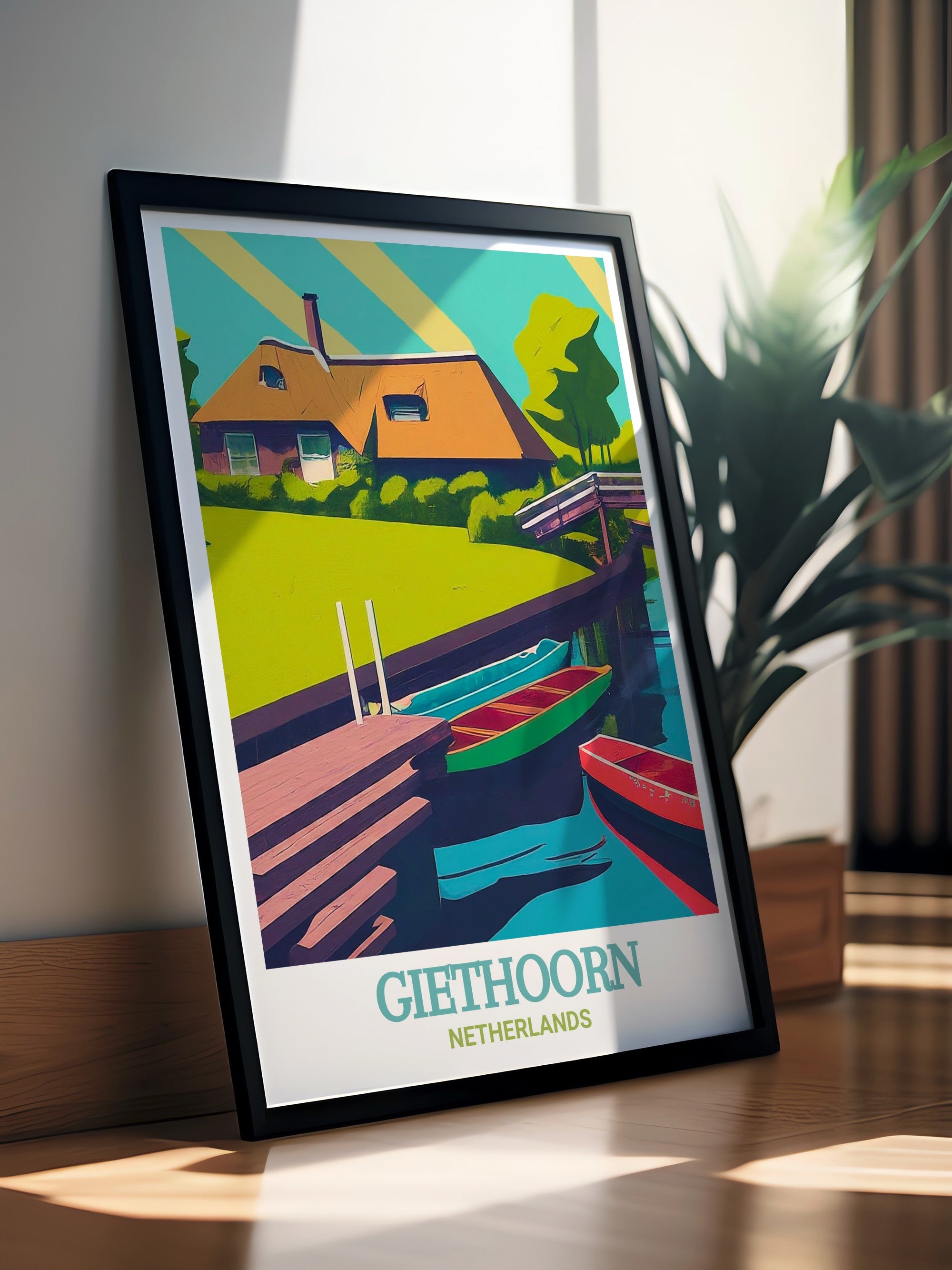
Giethoorn – Focal point strength in serene composition
Color Harmony & Contrast
Complementary colors create visual excitement. Analogous colors create calm. But here's what separates amateur from professional rooms: intentional contrast.
Your Netherlands wall art should echo 1-2 existing room colors while introducing a strategic contrast element. If your furniture is all neutrals, a landscape with warm sunset tones provides energy. If furniture features jewel tones, a black-and-white Dutch cityscape brings balance.
Iconic Dutch Landmarks & Their Living Room Impact
Not all Netherlands locations work equally well for living room settings. Each landmark carries psychological associations affecting mood and atmosphere.
Canal Architecture: Serenity & Sophistication
Amsterdam's Grachtengordel, Utrecht's Oudegracht, and Merwede Canal imagery create meditative, sophisticated atmospheres. Reflections in water add optical depth.
Merwede Canal – Water reflects light, expanding visual space
Water imagery soothes modern minds.
These pieces pair beautifully with Scandinavian, minimalist, and contemporary interiors. The cooler tones complement neutral furniture, while layered architectural details interest design-conscious viewers.
Historic Landmarks: Heritage & Gravitas
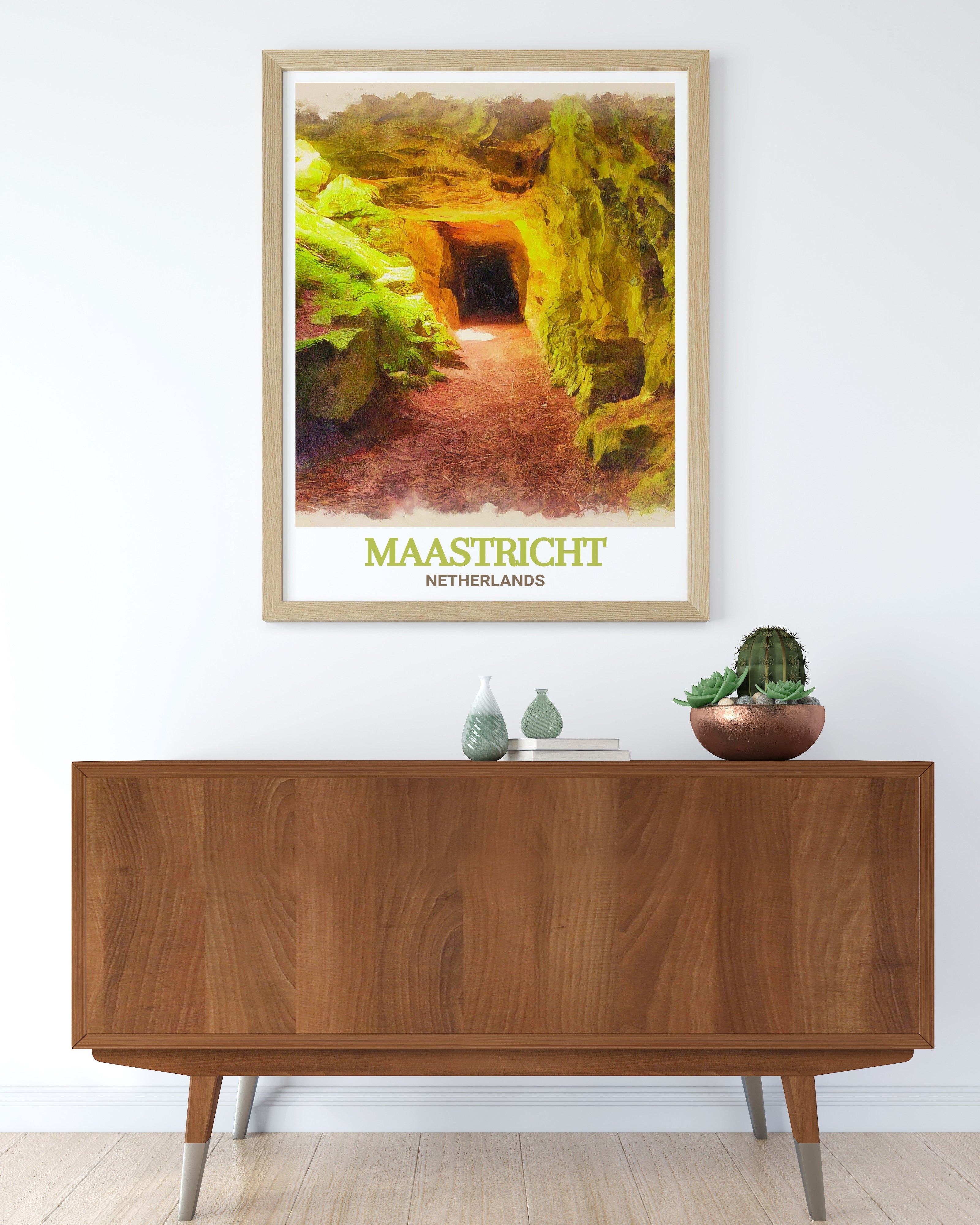
Basilicas, churches, castles, and museums project confidence and cultural refinement. Breda Castle, the Rijksmuseum, and St. Pietersberg Caves command attention without overwhelming.
Basilica of Saint Bavo – Architecture conveys permanence
Perfect for traditional, eclectic, and design-forward spaces. These pieces elevate conversation and suggest intellectual interests. Especially effective in home offices adjacent to living areas.
Natural Landscapes: Grounding & Calm
Forests, parks, and countryside scenes ground living rooms emotionally. Giethoorn's natural beauty and Westbroekpark's botanical richness create organic atmosphere.
Scheveningen – Coastal energy for open-concept living
Green and blue landscapes lower heart rates, reduce stress, and create restorative spaces. Scientifically proven to improve mental wellbeing in high-traffic family areas.
Wall Art Styles & Interior Compatibility
| Interior Style | Best Wall Art Types | Color Palettes | Scale Recommendation |
|---|---|---|---|
| Scandinavian | Black & white architecture, cool landscapes | Gray, white, soft blue | Medium (70×100cm) |
| Modern Minimalist | Single subject, geometric composition | Monochromatic, stark contrast | Large statement piece (90×120cm) |
| Eclectic/Bohemian | Gallery walls, mixed media, varied sizes | Vibrant, warm, earthy tones | Mix of sizes (40-70cm) |
| Traditional/Classic | Framed prints, heritage buildings | Rich colors, gilded frames | Medium-large (80×110cm) |
| Industrial | Urban photography, architectural detail | Black, concrete gray, metal tones | Large (100×120cm) |
Color Psychology & Mood Creation
Colors aren't neutral—they trigger measurable psychological responses.
Amsterdam Westerkerk – Cool blues promote calm focus
Cool tones (blues, greens, cool grays): Promote relaxation, expand perceived space, encourage conversation. Perfect for social gathering areas.
Warm tones (oranges, golds, warm grays): Create intimacy, feel welcoming, energize passive spaces. Ideal for rooms lacking natural light.
Neutral tones (blacks, whites, true grays): Provide sophisticated backdrop, emphasize architectural details, suit modern interiors.
Color shapes feeling more than composition.
The psychology principle works bidirectionally—your wall art influences the room's mood, and room's purpose influences which art works best. A living room for entertaining needs energizing pieces; one for family relaxation needs calming imagery.
Strategic Placement & Gallery Solutions
Single Statement Piece Strategy
One powerful 90-120cm piece commands more visual authority than three smaller works. Place directly above sofas (centered on wall, not sofa), above fireplaces, or on the wall visitors see entering.
Gallery Wall Composition
Combining 3-7 prints creates cohesive artistic story. Maintain 5-10cm spacing between frames. Use odd numbers (research shows 3, 5, or 7 feel more natural than 4 or 6).
Rijksmuseum – Perfect gallery wall centerpiece
Theme your gallery around: specific landmarks, color palette, style period, or emotional tone. Thematic unity prevents "random collection" appearance.
Over-Sofa Placement
Center artwork on wall, not sofa. If wall is 300cm wide and sofa 200cm, position art centered on full wall width. This balances proportion and creates intentional design.
Common Selection Mistakes to Avoid
Mistake 1: Ignoring room size. Small posters on vast walls disappear. Large pieces overwhelm cozy rooms. Measure before selecting.
Mistake 2: Conflicting color families. Warm and cool tones fighting for attention create visual tension. Choose pieces supporting existing palette.
Mistake 3: Wrong height placement. Art hung too high makes rooms feel cold. Too low appears crowded. Follow the 57-inch rule.
Mistake 4: Mismatched frame styles. Mixing frame colors without intention looks unplanned. Consistency = sophistication.
Small details create big impressions.
Mistake 5: Ignoring focal points. Art should enhance (not compete with) room's natural focus. Coordinate with existing architectural features.
🎯 Key Takeaways
- Design fundamentals matter: Proper height (57 inches), proportional sizing, and focal point strategy guarantee success
- Landmark choice affects mood: Canals soothe, architecture elevates, landscapes ground, coastal scenes energize
- Color psychology guides selection: Blues relax, warm tones welcome, neutrals sophisticate
- Interior style determines compatibility: Scandinavian favors cool tones; bohemian embraces vibrant mixes
- Gallery walls follow rules: Odd numbers (3, 5, 7), consistent spacing (5-10cm), thematic unity
- Avoid common pitfalls: Ignore size, don't mix color families, respect the 57-inch rule, maintain frame consistency
Expert Questions & Answers
We've answered the most important questions about choosing Netherlands wall art for living rooms.
Making Your Best Choice
Selecting the best Netherlands wall art for your living room isn't complicated—it's strategic. Apply these design principles, understand color psychology, and match selections to your interior style.
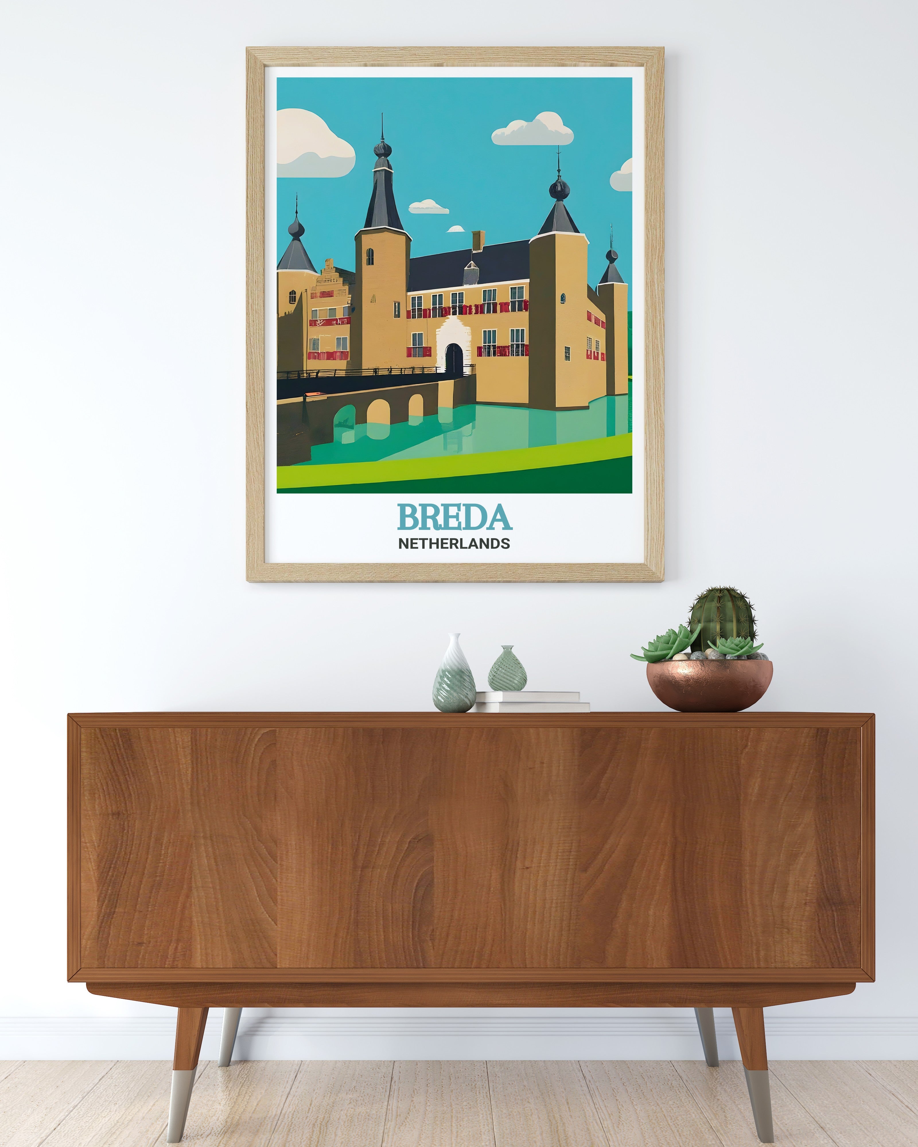
Breda Castle – Historic drama for statement walls
Your living room awaits transformation.
The difference between ordinary rooms and stunning ones rarely comes from expensive furniture—it comes from intentional, curated wall art that reflects personality while respecting design principles.
Netherlands wall art offers this perfectly. Every piece carries cultural depth, artistic merit, and proven interior compatibility. Whether you choose serene canal reflections, commanding architecture, or grounding landscapes, your selection shapes room atmosphere for decades.
Start with one piece. Hang it at proper height. Live with it for a week. Notice how light changes its appearance. Feel how it shifts room mood. Once you've experienced that transformation, expanding your collection becomes natural.
Ready to transform your living room? Browse our carefully curated collection of best-selling Netherlands wall art featuring iconic Dutch landmarks, professional photography, and quality materials. Every piece selected for living room compatibility, interior design alignment, and lasting value.