Lofoten Islands Posters: Framed Prints & Canvas Wall Art
Jagged granite peaks dropping straight into the sea. Red rorbuer cabins on stilts above the water. Northern lights over a village that barely holds a hundred people. Lofoten does not need embellishment — it needs a print that gets out of its way.
Search for Lofoten Islands posters and most results are stock photography sold by the print, one image among thousands with no curation behind it. Beautiful in isolation, but not designed as a collection, and not designed for a wall.
This collection takes a different approach. Five distinct treatments of the same archipelago: a minimalist illustrated cabin against a mountain peak, a watercolour fjord, a snow-dusted winter scene, a vintage travel illustration, and a coastal route map tracing Norway's E10 and Highway 1 north to the aurora. One place, five ways to hang it.
Choose your design, then choose your format — unframed Lofoten Islands print, framed in black, white or natural wood, or gallery-wrapped canvas wall art.
Three Lofoten Islands posters at A4, shown together. The clearest way to see how the collection's different treatments — illustrated, watercolour, vintage — sit side by side as a set.
Key takeaways
Five treatments of one archipelago. Minimalist red rorbu cabin illustration, watercolour fjord, winter snow scene, vintage travel poster, and a Norway coastal route map with aurora accent.
Three formats. Every design is available as an unframed Lofoten Islands print, a framed poster, or gallery-wrapped canvas wall art.
Materials. 200 gsm acid-free archival fine art paper, UltraChrome pigment inks, 380 gsm textured canvas on a timber stretcher.
The signature colour. Rorbuer red against granite grey and fjord blue is the palette that recurs across almost every design — a useful anchor when planning a room around this collection.
Sizing rule. Art should span roughly two-thirds the width of the furniture below it — usually A2 as a pair, or A1 as a single, above a sofa.
Five ways to hang the Lofoten Islands
Lofoten is unusually easy to over-design and unusually easy to under-design. Too much detail and the drama gets muddy. Too little and you lose the thing that actually makes the archipelago recognisable: the red cabins against grey stone.
Each design in this collection solves that balance differently — one through flat minimalist shape, one through soft watercolour wash, one through winter's reduced palette, one through vintage travel-poster styling, and one through cartography.
Minimalist red rorbu cabin & mountain peak illustration
This is the collection's signature design, and the one that photographs best on a wall. A single red rorbu cabin, flat and graphic, set against one sharp mountain peak. No horizon clutter, no sky detail — the cabin and the peak do all the work.
It reads at any distance. Across a room it registers as two shapes and one strong colour. Close up, the clean edges hold. That range is unusual for a minimalist design, and it is why this print pairs so easily with both modern and Scandinavian interiors.
Minimalist red rorbu cabin, satin paper. Styled beside a vase to show scale — the flat colour block holds its shape even next to a busier object.Same design, framed on a dark wooden shelf. Black frame against dark timber — proof the red holds its own even without a light, neutral background.
A close relative of this design swaps the single cabin for a small cluster of rorbuer, with the mountain rendered as a sharper arctic silhouette behind them.
Modern rorbuer cluster with arctic peak, black frame. Photographed side-on to show the frame profile — slim mouldings suit this much negative space.
Frame pairing: slim black for every minimalist design in this collection. A wide moulding competes with the flat shapes; a thin one disappears and lets the red lead.
Watercolour fjord with red rorbuer cabins
Where the minimalist design is graphic, this one is atmospheric. Soft washes of blue and grey build the fjord and the mountains behind it, with the rorbuer cabins painted in as the one saturated note in an otherwise gentle palette.
It is the print to choose if you want warmth rather than drama — a design that settles into a room instead of announcing itself the moment you walk in.
Watercolour fjord, cabins in red. The only saturated colour in the piece — everything else stays in soft blues and greys.
Pairing tip: the watercolour fjord is the gentlest design in the collection. Hang it in a bedroom or reading nook where you want colour without energy.
Winter snow: Lofoten under a fresh cover of white
Take the same red cabins and put them under snow, and the whole mood shifts. The palette narrows to white, pale grey-blue and that same recurring rorbu red, now doing even more work because there is less around it to compete with.
This is the design to choose for a cooler, quieter room — somewhere the Scandinavian instinct for restraint matters more than travel-poster drama.
Winter snow scene, satin paper by a window. Snow narrows the palette to three tones, and the rorbu red carries even more weight as a result.
Vintage Lofoten Islands travel illustration
This is the family for anyone who wants the archipelago to feel like a place you are planning to visit rather than a landscape you are admiring from a distance. Warm, slightly muted colour. Travel-poster type. A composition built the way mid-century tourism boards used to build them — mountain, cabin, water, in that order of visual weight.
It is also the most versatile design for gifting. The vintage travel treatment reads as intentional and considered in a way a straight photograph rarely does.
Vintage travel illustration, unframed. The heavy 200 gsm sheet lies flat on a table without curling — ready for a poster hanger or your own frame.Same design, framed in natural wood. Warm timber against warm illustration colour — the pairing we recommend most for this print.
Norway coastal route map: Oslo to Tromsø, with the aurora
Not every Lofoten fan wants a landscape. Some want the journey. This design traces the coastal route from Oslo north to Tromsø — the E6, the E10, the ferries — as a clean transit vector line, with a soft aurora wash across the top of the print marking the region where the lights actually appear.
It works as a solo statement piece and as a companion to any of the illustrated designs above, since it tells the geographic story that the landscape prints only imply.
Oslo–Tromsø coastal route map, aurora accent. Clean transit-vector lines trace the journey north, with the northern lights rendered as a soft wash rather than a literal sky.
Pairing tip: hang the route map beside the minimalist cabin print. One shows where Lofoten is, the other shows what it looks like once you arrive — a natural two-piece story for a hallway or entryway.
Lofoten Islands wall art, styled in more rooms
A print looks different in every room it enters. Here are three more ways the collection's designs sit once they are actually hung.
Minimalist cabin print above a sideboard. Pared-back furniture, natural light, one confident colour accent.Watercolour fjord in a reading corner. Soft tones settle into the room rather than compete with the furnishings around them.Vintage travel illustration near a desk. Warm tones and a wood frame give a small workspace a personal, considered feel.
Looking beyond the archipelago? The wider Norway collection covers fjords, cities and the full coastal route, in the same formats and finishes.
Lofoten Islands print, framed poster or canvas: choosing a format
The design carries the atmosphere. The surface decides how that atmosphere reads on the wall.
Format comparison for Lofoten Islands posters, framed prints and canvas wall art
Format
Surface
Best for
Hanging
Watch out for
Unframed Lofoten print
200 gsm archival matte or satin fine art paper
Renters, gallery walls in progress, gifting flat, large sizes on a budget
Poster hanger, clips, or your own frame
Needs framing or a hanger to look finished
Framed Lofoten poster
Same paper, glazed, in black, white or natural wood
Minimalist and map designs, offices, hallways, anything ready to hang
Arrives with hardware fitted
Glazing reflects — avoid hanging facing a window directly
Lofoten canvas
380 gsm textured poly-cotton on a timber stretcher
Watercolour and winter designs at larger sizes, statement walls
Hangs straight from the frame, no glass
Texture slightly softens the sharpest minimalist edges
When canvas wins
Choose canvas for the watercolour fjord and the winter snow scene. Both have soft tonal gradients that canvas texture flatters, and there is no glass to reflect a lamp or window in a room with changing light.
When framed paper wins
Choose framed paper for the minimalist cabin illustrations and the coastal route map. Flat colour blocks and fine map lines need a smooth surface and a hard edge — canvas is the one thing that can soften a crisp graphic shape.
Sizing your Lofoten Islands poster
Size is where wall art usually goes wrong. Too small and the piece floats in the middle of nothing. Too large and the room tips forward.
Size guide for Lofoten Islands wall art by wall position and furniture width
Size
Dimensions
Works above
Recommended use
A4
21 × 29.7 cm / 8.3 × 11.7 in
Desks, shelves, narrow alcoves
Grids of two or three designs shown together
A3
29.7 × 42 cm / 11.7 × 16.5 in
Bedside tables, consoles, cloakrooms
Pairs and triptychs; single prints in small rooms
A2
42 × 59.4 cm / 16.5 × 23.4 in
Two-seat sofas, sideboards, double beds
The default for one framed Lofoten print in a living room
A1
59.4 × 84.1 cm / 23.4 × 33.1 in
Three-seat sofas, dining walls, stair landings
Single statement piece; watercolour or winter designs on canvas
Styling and decor: where Lofoten Islands wall art belongs
A print is half the decision. The wall is the other half.
Living room focal point
One large piece beats three small ones above a sofa. Hang a single A1 canvas of the watercolour fjord or winter snow scene, centred, with 15 to 20 cm between the sofa back and the bottom of the frame. If the room already carries colour and pattern, switch to the minimalist cabin print and let the furniture lead.
Gallery walls that hold together
Lofoten's recurring red makes gallery walls easier than usual to plan, since every design shares an accent colour even across very different styles.
One place, five treatments. Minimalist, watercolour, winter, vintage and map, in matching black frames, evenly spaced.
One colour thread. Any three designs hung together read as a set simply because the rorbu red recurs in each one.
Map plus landscape. The route map paired with one illustrated design — geography on one side, atmosphere on the other.
Keep gaps tight and even, 4 to 6 cm. Wide, uneven spacing is what makes a gallery wall look accidental rather than planned.
Home office and study spaces
The minimalist cabin illustration and the coastal route map both work well behind a desk. Neither has enough detail to pull focus during a call, and both give the eye somewhere quiet to land between tasks.
Hallways and entryways
This is where the route map earns its keep. Hang it beside a landscape design — minimalist cabin or vintage travel illustration both work — so the first thing anyone sees on the way in is where the place is, followed immediately by what it looks like.
Bedrooms
Go quiet and atmospheric. The watercolour fjord is the natural choice, since its soft palette suits a room built for winding down. Canvas is the better surface here — no glass, no reflected bedside lamp.
Room-by-room pairings for Lofoten Islands posters
Room
Recommended design
Format
Frame finish
Living room
Watercolour fjord or winter snow scene
A1 canvas
Gallery wrap, no frame
Dining room
Vintage travel illustration
A2 framed
Natural wood
Home office
Minimalist cabin illustration or route map
A2 framed
Slim black
Hallway or entryway
Route map paired with a landscape design
Two × A3 framed
Slim black
Bedroom
Watercolour fjord
A1 canvas
Gallery wrap
Study or desk
Modern rorbuer cluster with arctic peak
A4 or A2 framed
Slim black
Gallery wall
All five designs, matched frames
A3 framed set
Matching slim black
Craftsmanship, paper and framing finishes
Everything here is printed to order. Nothing sits in a warehouse quietly losing colour.
Archival paper
Our standard stock is 200 gsm acid-free fine art paper with a smooth matte surface. It holds a fine minimalist edge without ink spread, and being acid-free it will not yellow the way cheap poster stock does. Satin is offered on the watercolour and winter designs: a little more depth in the tonal washes, noticeably less glare.
Pigment inks
We print with UltraChrome pigment inks rather than dye. Pigment sits on the surface as encapsulated particles instead of soaking into the fibre and breaking down, which is what gives archival prints their fade resistance under normal indoor light — important here, since the rorbu red is the one colour every design depends on staying saturated.
Canvas construction
Canvas prints are 380 gsm textured poly-cotton, stretched over a solid timber subframe and hand-wrapped at the corners. The image continues around the edge, so no frame is required, and hanging hardware comes fitted. A canvas at A1 also weighs less than the equivalent glazed frame — useful on plasterboard.
Framing finishes
Three finishes, chosen to cover most interiors rather than to pad out a menu.
Slim black. The default for minimalist illustrations and the route map. Disappears and lets the shapes lead.
White. Best for the winter snow design, keeping the palette cool and bright.
Natural wood. Warms the vintage travel illustration and bridges to oak, walnut, cane and rattan furniture.
Mounts are available from 40 mm. Every framed piece ships glazed and ready to hang.
Care: keep framed prints out of direct sun and away from bathroom steam. Dust canvas with a dry soft brush — never a damp cloth. That is the whole routine.
Finding the right Lofoten Islands print for what you are actually searching for
People arrive here from very specific searches. Here is the shortest route from each one to the right design.
Matching common Lofoten Islands searches to the right design and format
What you are looking for
Best match
Format we suggest
Minimalist Lofoten Islands wall art with a red cabin
Minimalist red rorbu cabin illustration
A2 framed, slim black
Lofoten Norway posters with a soft, painterly feel
Watercolour fjord with rorbuer cabins
A1 gallery-wrapped canvas
Lofoten Islands prints for a cooler colour scheme
Winter snow scene
A1 canvas or A2 framed, white
Vintage-style Lofoten Islands art print
Vintage travel illustration
A2 framed, natural wood
Norway route map showing Lofoten
Oslo–Tromsø coastal route map
A2 framed, slim black
Lofoten Islands poster set for a gallery wall
All five designs, matched frames
Five × A3 framed, identical frames
Lofoten wall art for a rented flat
Any design, unframed
A3 unframed with a poster hanger
Bold, colourful Lofoten Islands print
Minimalist cabin or vintage illustration
A2 framed or canvas
Lofoten Islands art print for an entryway pair
Route map plus one landscape design
Two × A3 framed, matching
Large statement Lofoten canvas
Watercolour fjord at A1
A1 gallery-wrapped canvas
Lofoten Islands posters as a gift
A design this recognisable travels well as a present, especially for anyone who has already been north of the Arctic Circle and wants to keep the memory in the room.
For a traveller who has visited, the vintage travel illustration or the watercolour fjord tends to land hardest, since both carry the nostalgia of a trip rather than just the geography. For a Norway or Scandinavia enthusiast who hasn't been yet, the minimalist cabin print signals aspiration without needing a personal connection. For a planner, the coastal route map doubles as a piece of decor and a conversation starter about the next trip north.
Frequently asked questions
What designs are included in this Lofoten Islands posters collection?
Five treatments of the archipelago: a minimalist red rorbu cabin and mountain peak illustration (plus a modern rorbuer-cluster variant), a watercolour fjord with red cabins, a winter snow scene, a vintage travel-poster illustration, and a Norway coastal route map tracing Oslo to Tromsø with an aurora accent.
Are these Lofoten Islands posters available framed?
Yes. Every design can be ordered framed in slim black, white or natural wood. Framed prints are glazed, fitted with hanging hardware, and arrive ready to hang. Mounts of 40 mm and above are available.
Can I get Lofoten Islands wall art on canvas?
Yes. Canvas prints are gallery-wrapped on 380 gsm textured poly-cotton over a timber stretcher, with the image continuing around the edges so no frame is needed. Canvas suits the watercolour fjord and winter snow designs especially well, since both have soft tonal gradients that canvas texture flatters.
Which Lofoten Islands print works best above a sofa?
A single A1 piece, ideally the watercolour fjord or winter snow scene on canvas. Aim for artwork spanning roughly two-thirds the width of the sofa, and leave 15 to 20 cm between the top of the sofa back and the bottom of the frame.
What paper and inks do you print on?
Standard stock is 200 gsm acid-free archival fine art paper with a matte finish, with satin available on the watercolour and winter designs for extra depth in the tonal washes. We print with UltraChrome pigment inks, which resist fading under normal indoor lighting and keep the rorbu red saturated over time.
Do you offer a map of the Lofoten Islands as well as landscape prints?
Yes. The Norway coastal route map traces the journey from Oslo north to Tromsø as a clean transit-vector line, with a soft aurora wash marking the region where the northern lights appear. It pairs naturally with any of the illustrated landscape designs.
Which Lofoten Islands artwork suits a small room?
The minimalist red rorbu cabin illustration at A3. It carries very little visual weight, so it adds colour and interest without shrinking the space, unlike a large watercolour or vintage piece which can dominate a small wall.
How do I build a gallery wall from this collection?
Hold one variable constant. Either hang all five designs together in matching black frames, since the recurring rorbu red ties them visually, or pick three designs and lean on that same red thread. Use identical frames and consistent 4 to 6 cm gaps throughout.
Is a Lofoten Islands poster a good gift?
Very much so. The vintage travel illustration and watercolour fjord suit anyone who has visited, since both carry a sense of memory rather than just geography. The minimalist cabin print works for a Norway enthusiast who hasn't travelled there yet, and the route map suits a planner still dreaming up the trip.
Do unframed Lofoten Islands prints arrive ready to display?
Unframed prints ship flat in a rigid sleeve at smaller sizes and rolled in a protective tube at larger ones. The 200 gsm stock is heavy enough to sit flat in a standard frame or a poster hanger without curling, which makes it a practical choice for renters and for gifting.
How should I care for my print or canvas?
Keep pieces out of direct sunlight and away from humid rooms such as bathrooms. Wipe glazing with a dry microfibre cloth. Dust canvas with a dry soft brush rather than anything damp, and avoid cleaning sprays on either surface.
Printed to order in museum-quality archival materials. Lofoten Islands posters, framed prints and canvas wall art from MapYourDreams.
This Akiba Shrine at Ukeji print by Hiroshige has such lovely perspective and depth, very typical of his best landscape work. The colors are rich without being overly saturated, keeping that classic ukiyo-e feel. Print quality is excellent with sharp detail throughout the composition. A beautiful addition for anyone who loves traditional Japanese landscape prints.
The ghost of Okiku print rounds out our little collection of Hokusai's supernatural series and it is just as striking as the others. The detail in the figure and background elements has translated really well into print. It is a fantastic, moody addition for anyone who loves Japanese folklore art. Great quality for the price.
Rounds out our little collection of supernatural prints and it's just as striking as the rest. Detail in the figure translated really well into print. Moody, fantastic addition for folklore art fans.
Simple, elegant, full of quiet detail in the feathers and posture. Fits perfectly among our other bird and flower prints. Natural, well-balanced coloring, crisp overall.
This 1834 hawfinch print by Hokusai is simple, elegant, and full of quiet detail in the bird's feathers and posture. It fits perfectly among our other Japanese bird and flower art prints. Print quality is crisp with natural, well-balanced coloring. A lovely, understated piece for anyone who loves Hokusai beyond just the Great Wave.
The ghost of Oiwa print is hauntingly beautiful, one of Hokusai's most famous supernatural pieces and this print captures the eerie detail really well. It is not for everyone but if you love classic Japanese ghost art, this is a fantastic addition. Print quality is sharp with rich, dark tones throughout. A striking, unusual piece for a gallery wall with personality.
Hauntingly beautiful, one of the most famous supernatural pieces Hokusai created. Not for everyone but a fantastic addition if you love it. Rich, dark tones throughout, sharp printing.
Properly eerie in the best way, perfect for fans of Hokusai's darker supernatural side. Linework in the ghostly figure preserved impressively well. Fun conversation piece in our home office.
This ghost of Kohada Koheiji print is properly eerie in the best way, perfect for anyone who loves the darker, supernatural side of Hokusai's work. The linework detail in the ghostly figure is impressively preserved in the print. It has become a fun conversation piece in our home office. A great pick for fans of Japanese ghost stories and yokai art.
Delicately rendered, full of soft color and fine detail. Gentle energy on our bedroom wall now. Smooth printing with beautifully balanced pastel tones.
The peonies and canary in this 1834 Hokusai print are so delicately rendered, full of soft color and fine detail. It brings a lovely, gentle energy to our bedroom wall. Print quality is smooth with beautifully balanced pastel tones. A gorgeous, less common choice from Hokusai's flower and bird series.
Wonderful energy and movement, a less common piece which felt special to own. Crisp, museum-poster quality throughout. Great pick for collectors wanting to go beyond the usual Hokusai favorites.
This 1822 Harugoma print by Hokusai has such wonderful energy and movement, it is a less common piece which made it feel special. Print quality has that museum-poster crispness I was hoping for. It looks great alongside our other Japanese art prints in the hallway. A great pick for collectors who want to go beyond the usual Hokusai favorites.
So much richer in person than I expected from a reproduction. Foam and Mount Fuji details come through beautifully. No color bleeding, highly recommend for fans of this legendary piece.
This 1831 edition style print of the Great Wave off Kanagawa by Hokusai is stunning in person, so much richer than I expected from a reproduction. The details in the foam and Mount Fuji in the background come through beautifully. Print quality is excellent with no color bleeding. Highly recommend for anyone who loves this legendary piece of Japanese art.
This Akiba Shrine at Ukeji print by Hiroshige has such lovely perspective and depth, very typical of his best landscape work. The colors are rich without being overly saturated, keeping that classic ukiyo-e feel. Print quality is excellent with sharp detail throughout the composition. A beautiful addition for anyone who loves traditional Japanese landscape prints.
The ghost of Okiku print rounds out our little collection of Hokusai's supernatural series and it is just as striking as the others. The detail in the figure and background elements has translated really well into print. It is a fantastic, moody addition for anyone who loves Japanese folklore art. Great quality for the price.
Rounds out our little collection of supernatural prints and it's just as striking as the rest. Detail in the figure translated really well into print. Moody, fantastic addition for folklore art fans.
Simple, elegant, full of quiet detail in the feathers and posture. Fits perfectly among our other bird and flower prints. Natural, well-balanced coloring, crisp overall.
This 1834 hawfinch print by Hokusai is simple, elegant, and full of quiet detail in the bird's feathers and posture. It fits perfectly among our other Japanese bird and flower art prints. Print quality is crisp with natural, well-balanced coloring. A lovely, understated piece for anyone who loves Hokusai beyond just the Great Wave.
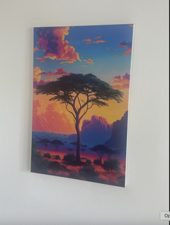
Really lovely piece of art — the Serengeti canvas print looks even better in person
Really lovely piece of art — the Serengeti canvas print looks even better in person. I’m also happy they were able to tweak it a little for me to get it just right. The colors and detail bring such a calm, warm vibe. Definitely recommend!
Serengeti Poster - Acacia Tree Vintage Art - Savanna Prints - Tanzania Home Decor
Maria Dabau
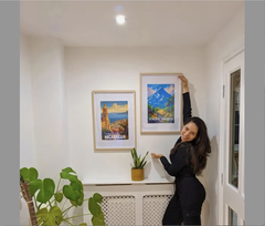
I am so happy with this print of Nicaragua
I am so happy with this print of Nicaragua, exactly what I was looking, you can see the details even better in person, I did like when I saw it online but I love it when I saw it in person, high resolution. Can't stop looking at this corner🫶
Nicaragua Art - Volcanoes Perfect Home Decor - Nicaragua Decor
Christy Camba
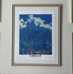
I highly recommend the costumer service of this artist
I highly recommend the costumer service of this artist, is so kind making sure that I receive the art how I wanted. It looks beautiful in my wall! ♥️
Caracas Art Prints - Avila Mountain Travel Posters - Venezuela Travel Poster Print
Lalena Stavinoha
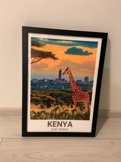
I purchased this Kenyan print as a gift for my husband
I purchased this Kenyan print as a gift for my husband, and we are absolutely in love with it. We visited Kenya together last summer, and this artwork captures the exact feeling of that trip — the colors, the culture, the warmth… everything. It now hangs proudly in our living room and every time we look at it, we’re transported right back to those sunrise drives and laughter-filled evenings. The quality is stunning, the details are beautiful, and it arrived carefully packaged. Truly a meaningful piece that turned into a memory on our wall. Highly recommended!
Kenya Vintage Prints - Nairobi National Park Travel Posters - East Africa Decor
Jen Stewart
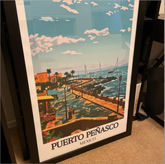
The Puerto Peñasco print is gorgeous
The Puerto Peñasco print is gorgeous. The colors are vibrant and as soon as we put it in a frame it was magnificent. Highly recommend this seller. Great products, great communication from seller on the process.
Puerto Peñasco Travel Print - Malecon Wall Art - Sea of Cortez Travel Poster - Puerto Peñasco Wall Print